Text that is hard to read
When words blend into the background, people with weak eyesight can miss them. It can happen in a paragraph, on a button, or beside a form box.
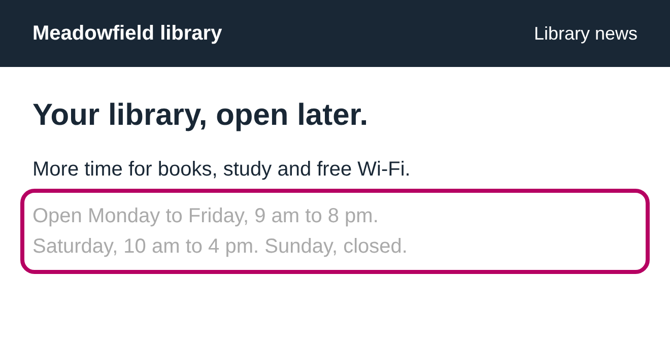
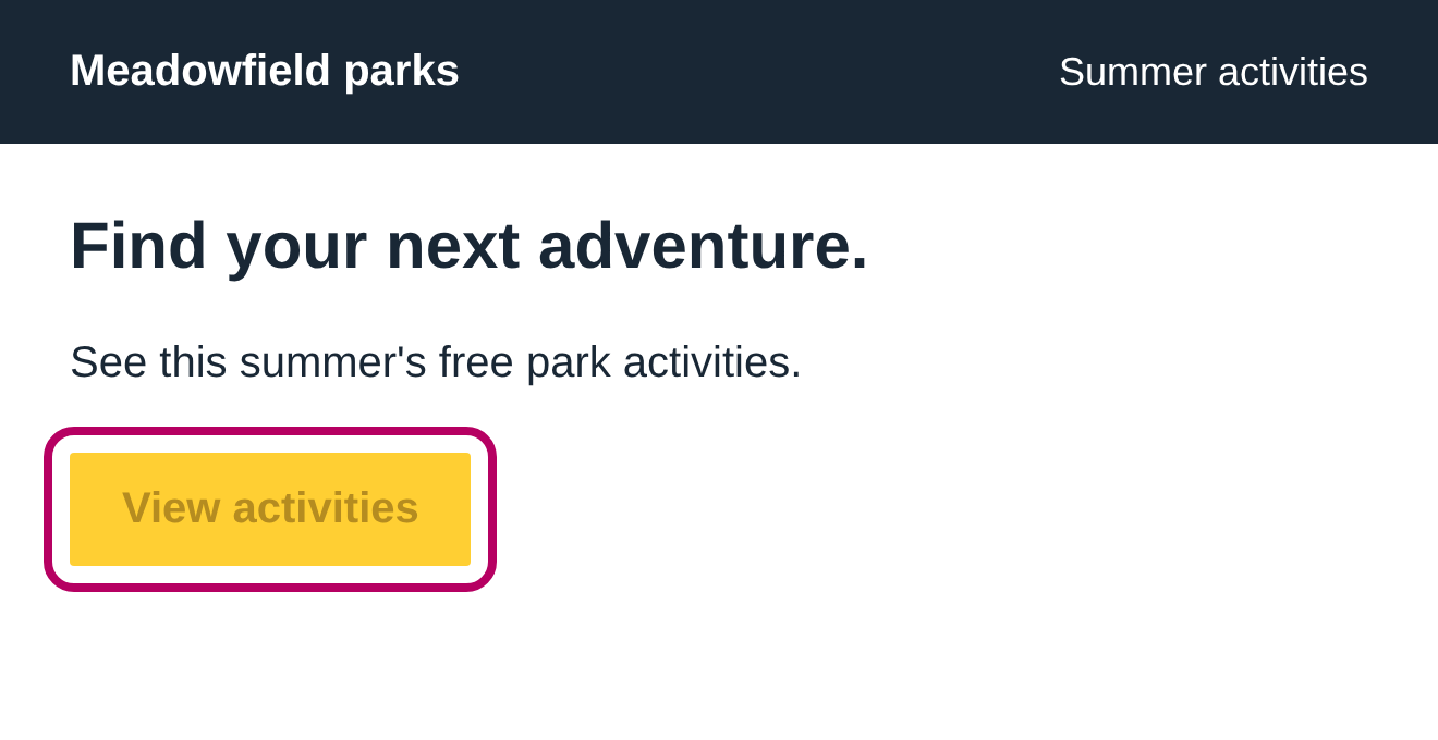
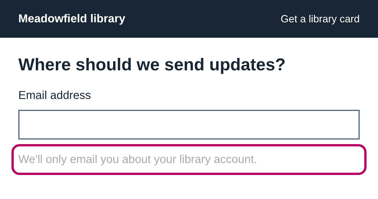
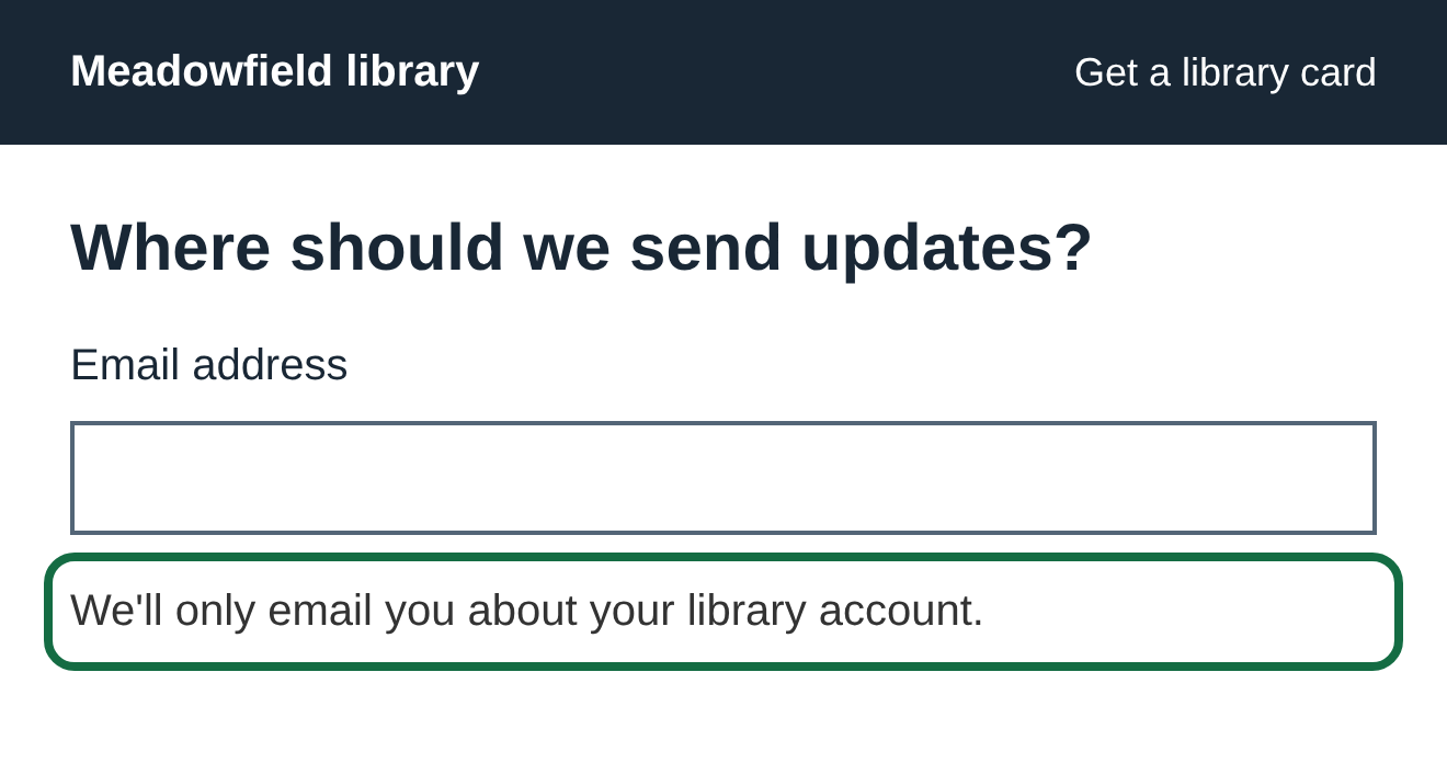
- Look inside the pink outline in each “Before” picture.
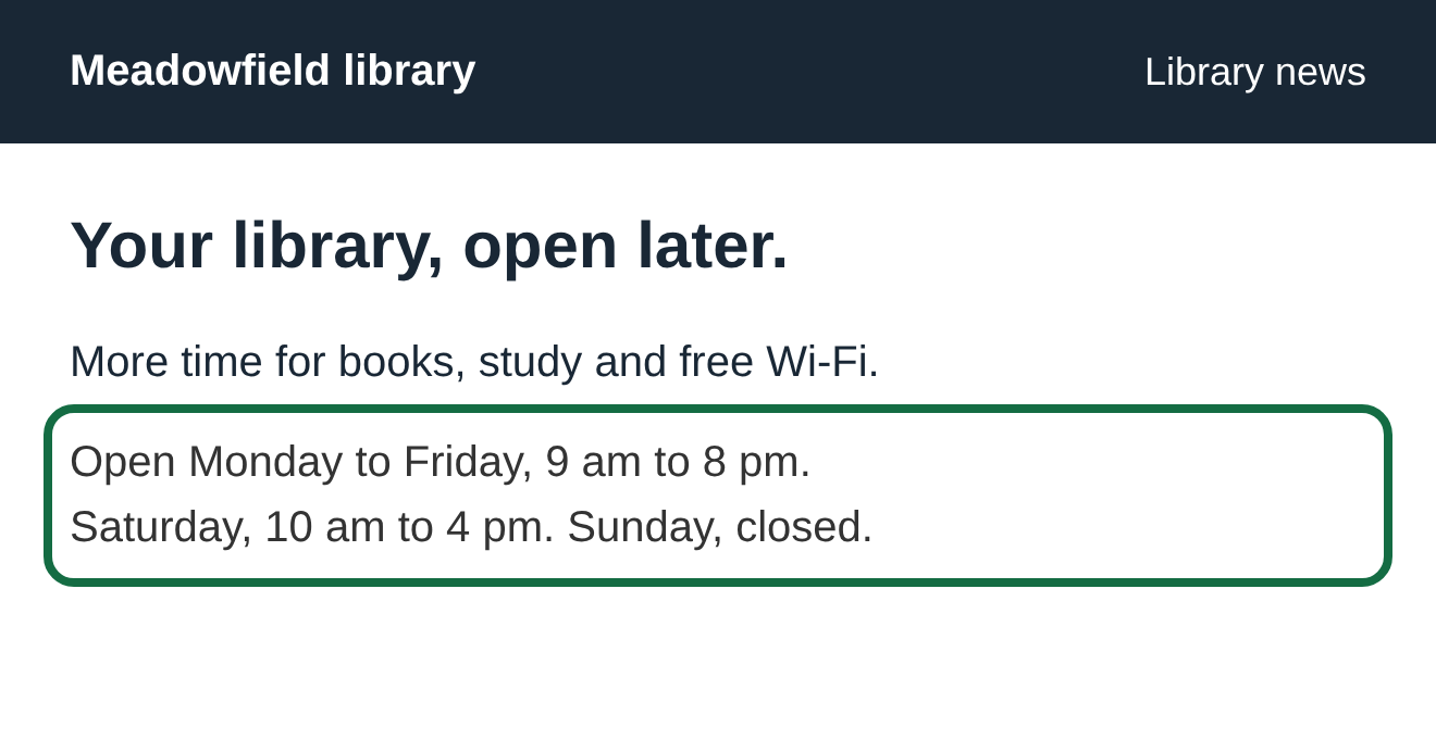
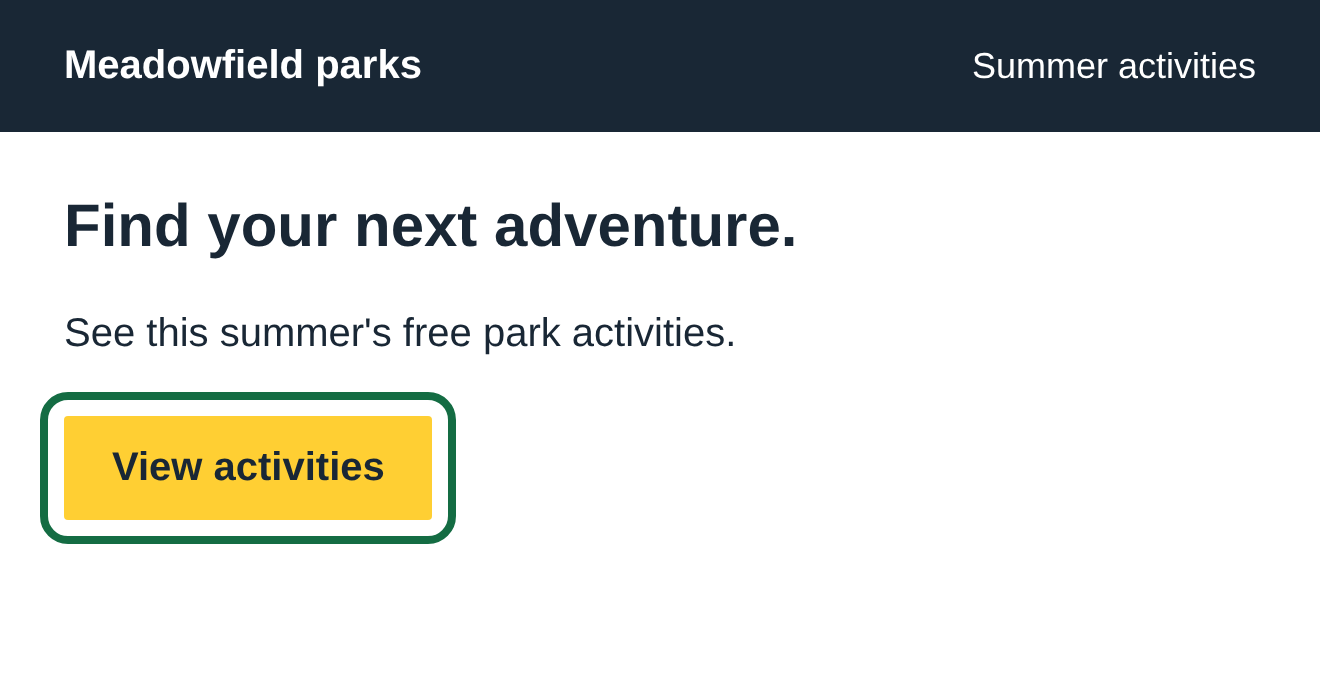
- The “After” picture shows the same words with a clearer color.
- Look for the same problem on your own page.
These are screenshots of example pages we built for this guide. They show specific problems, without naming or judging another website.
01 Faint words on a light background
The hours matter just as much as the heading. Making them pale gray can make them disappear for someone with weak eyesight.
Before
After
What to change
Change the text color in your page editor or theme settings. On a white background, dark gray or black is a good place to start. Check small print, dates and footer text too.
Check it yourself
In your ADA Gap report, open “See colors and a fix.” It shows the two colors and a suggested replacement. Change the color, save the page, then run the check again.
02 A bright button with hard-to-read words
A button can be easy to spot while its words are hard to read. The color behind the words matters, even if the button looks bold.
Before
After
What to change
Keep the button color if you like it. Change the words to a much darker color. On a dark button, use light words instead.
Check it yourself
Measure the words against the button fill, rather than the page behind the button. Check the button before and while you hover over it. Each state needs readable words.
03 Important instructions that look like fine print
People need to read the instructions before they fill in a box. Those words should not fade away just because they are secondary.
Before
After
What to change
Give the instructions a clear text color. Check hints, required-field notes and error messages too. Keep a visible label above the box so its purpose stays clear while someone types.
Check it yourself
Read the whole form, including the short words below each box. Check again after submitting an empty form, because error messages may use different colors.
How clear is clear enough?
A contrast number compares how light or dark the words are with what is behind them. A bigger number means they stand apart more.
The standard calls for at least 4.5 to 1 for normal text and 3 to 1 for large text. Large means about 24 pixels, or about 19 pixels when bold. Aiming for 7 to 1 for ordinary text gives more people a comfortable reading experience.
Text over a photo needs extra care: the background changes from one part of the photo to another. Try a solid fill behind the words. A computer may leave this for a person to check.
Read the source: W3C’s explanation of text contrast and stronger contrast for low-vision readers.
Find it on your own page
Check your website or PDF, or see the next guide: links and buttons that explain themselves.