Links and buttons that explain themselves
People who are blind often use a screen reader, a tool that reads the page aloud. They may listen to a list of links, or move straight from button to button.
Clear names help them choose the right thing. They also help everybody else skim the page.
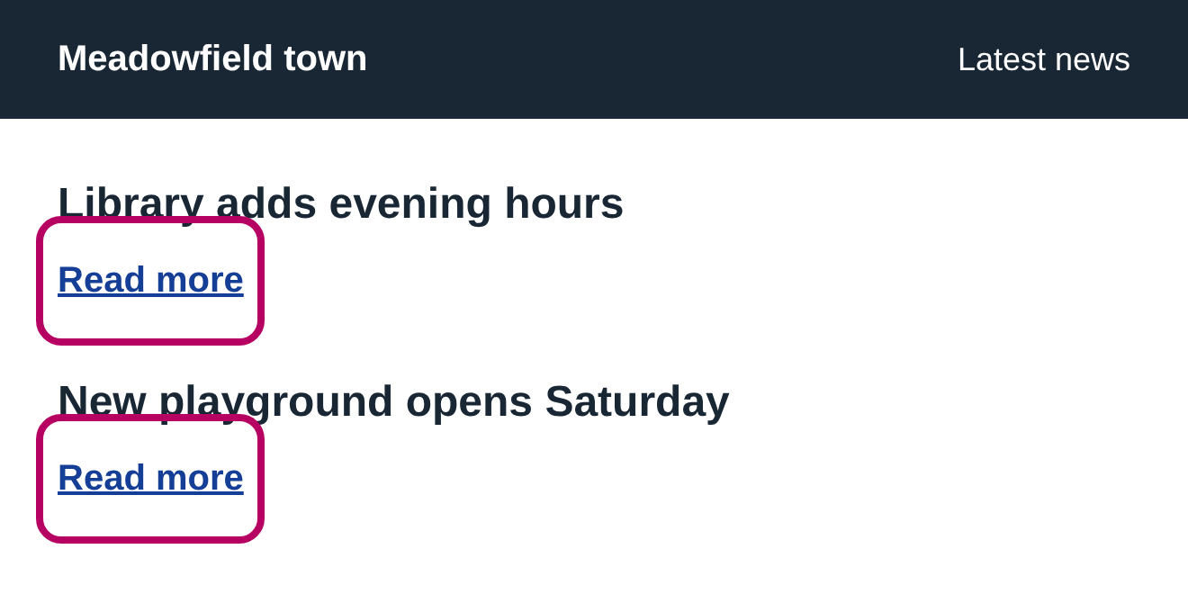
- Look inside the pink outline in each “Before” picture.
- Read the link or button’s words on their own.
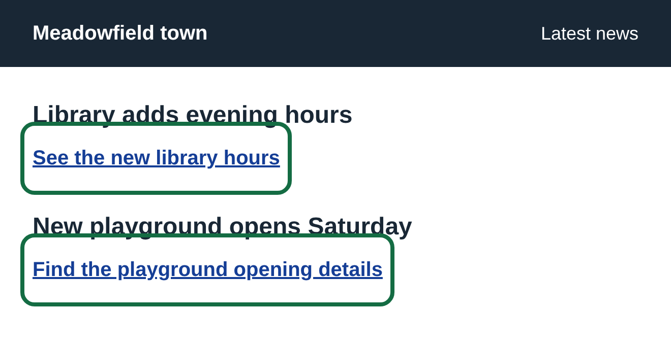
- The “After” picture gives the same action a useful name.
These are screenshots of example pages we built for this guide. The screen reader notes explain the name available in the page; the exact words a device speaks can vary.
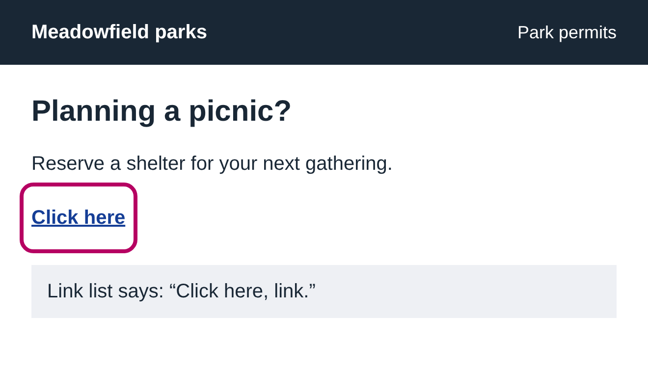
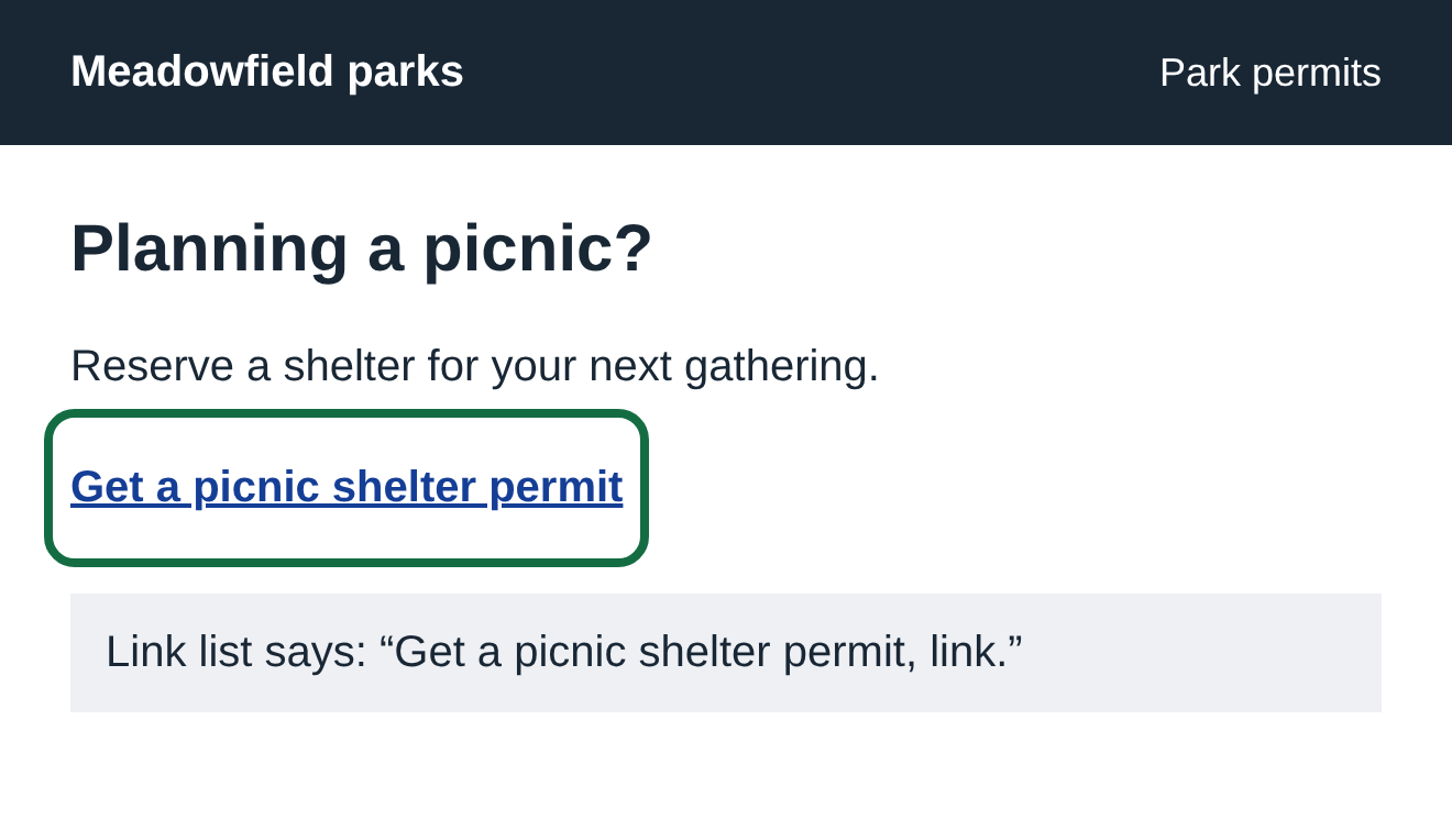
01 “Click here” doesn’t say where
The paragraph gives a clue, but a person listening to the link on its own only hears “Click here.” A useful name travels with the link.
Before
After
What to change
Select the linked words in your editor and replace them with what the person will find or do. For a document, try “Download the picnic shelter application (PDF)” rather than its file name.
Check it yourself
Cover the paragraph around each link and read just the linked words. Can you tell where it goes? Nearby text can sometimes satisfy the standard, so a vague link is something to review rather than automatic proof of a broken rule.
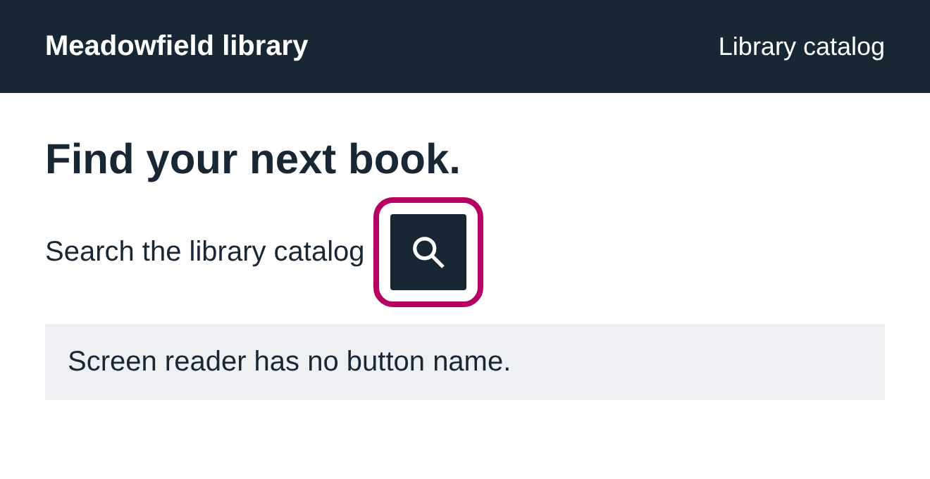
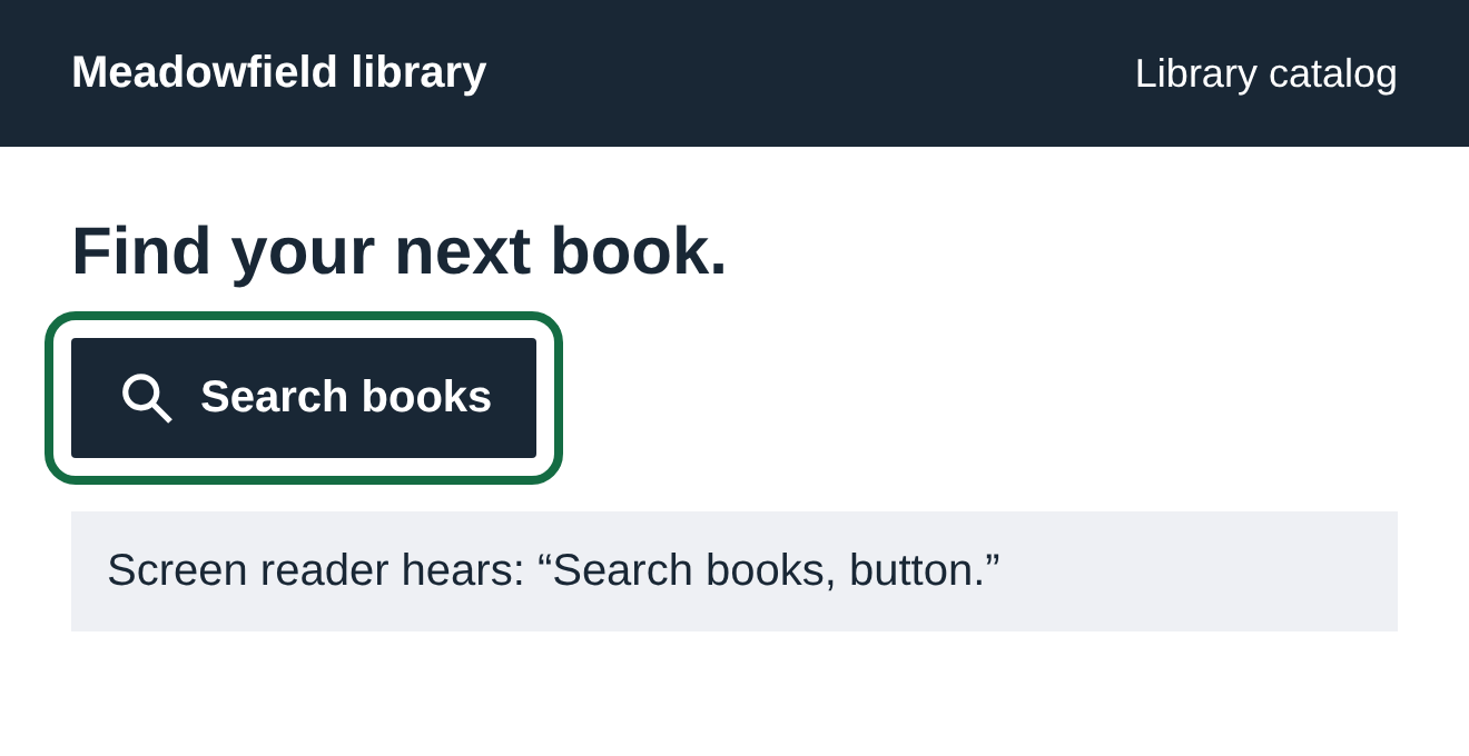
02 An icon button with no name
A magnifying glass suggests search to someone who sees it. If the button has no name in the page, a screen reader cannot explain its job.
Before
After
What to change
Add short visible words when you can. If you need an icon-only button, ask your website company to give it a hidden name, such as “Search books.” The hidden name should include any words that are visible on the button.
Check it yourself
Listen to the button with a screen reader. On Windows, Windows + Ctrl + Enter opens Narrator. On a Mac, Command + F5 opens VoiceOver. Move to the button and listen for its purpose. Hover text alone is not a reliable fix.
03 Several links that all sound the same
Two “Read more” links may look clear beside two article headings. In a list of links, they can sound identical even though they open different pages.
Before
After
What to change
Use the story’s topic in the link words, or make the story heading itself the link. Your website company can also add a hidden description that includes the visible words.
Check it yourself
Read the links as a short list, without the headings above them. Different destinations should be easy to tell apart. If repeated words go to the same place, repeating them may be fine.
What the automatic check can tell
ADA Gap can find links and buttons with no name. It also points out words such as “Click here” for a person to review. A computer can’t reliably decide whether every name makes sense.
A useful name is only the start. A person still needs to check that the link opens the right place and the button works with a keyboard.
Read the source: W3C’s explanation of link purpose and how controls get their names.
Find it on your own page
Check your website, or see the other guide: text that is hard to read.